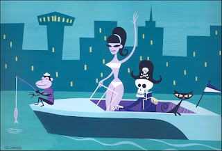
Top image: Josh Agle
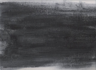
Bottom image: my study
The colors and the monkey's shirt still need tweaking...I started to make the shapes seem more humanistic as suggested by professor Babcock. The recreation of the seasponge on canvas worked really well.

Running a gradient map over the above image replicates the texture perfectly.
Also my new tablet came in this afternoon...Its a little tiny but surprisingly came with a copy of photoshop elements 6, corel painter and some program called Nik Color Efex Pro that I have never heard of. It was definitely worth the $85 investment and highly recommended.
(Edit: after looking at the zoomed in image on here, I noticed the canvas texture was a little too prominent. On my next pass I plan on turning down the opacity on the texture layer to fix this)

Looking good! On the bathing suit using the pathfinder for intersections will give you nice separations without having to try to follow the figure contour. Notice that the buildings also have a slight texture and that the hue changes from water to sky.
ReplyDeleteJust waiting on the original Mike Freeman image using this technique.
ReplyDelete