Thursday, July 30, 2009

I broked blogger

http://mikefreemanart.blogspot.com/

After pretty much destroying the template and trying to figure out how it worked. This is about how far I got in one days worth of work including distractions (breakfast and lunch with parents, getting forced into manual labor at my dads garden..and so on)

the links for the other pages are going to go in the bar on the right. Currently the images are just a piece of template code i wrote to make sure lightbox worked.

I am kinda having problems getting the images to fit within the squares I have on the background. I would like to have two of the pages working before the final is due.

Jessica Pine sent me this amazing email that is essentially a walkthrough of how she set up her blogger portfolio. It has been a great resource and i probably wouldnt have gotten this far in one day without it. Thanks again.

Process thus far:
step 1: create new blog
step 2: using photoshop take my sketch and template it out using the images i want
step 3: abuse the html command for "display:none" to figure out what all the little code bits do
step 4: insert lightbox onto blogger
step 5: get template images onto the blog to make sure lightbox works
step 6: using the margins and padding get the template images where I want them

Next steps:
step 7: figure out why i can only get 1 image to a column
step 8: create a second post and figure out how to link between the two
step 9: create thumbnails for my illustration projects
step 10: create thumbnails and jpgs for some other random projects
step 11: create a few pages as separators for my logo, advertising, and packaging work

I have a wedding to go to on sunday (i dont understand who gets married on a sunday....but then again, i havent been to church since i was 5 so what do i know) so on saturday I will post my most current progress, "final blog post" as well as upload everything to the servers

Tuesday, July 28, 2009

Website research findings and sketch

The kind of sites I have been looking at are heavily html based and are actually probably easier to pull off than they seem.

After looking at some of the sites I really liked from interactive design class and kinda sketched out what I want to do. I really liked the watercolor background that I used in the past so I think those will be recycled however to clean it up I dont think I am going to go as full blown with whatever style it was that I was going with.

Next step is to template all this out in html.


Final Proposal

I kinda jumped the gun on those can templates...they would have worked pretty well for a final...however this gives me a chance to do something else that should also be useful. So for my final I am proposing a new portfolio website. I have the shell of a flash portfolio website that I would like to finish before I graduate, however since I do not have flash at home I can't really work on it here for this.

Flash Site: http://www.grin3design.com/members/freeman/portfolio/portfolio.html

One of the problems that I started to notice with my flash website is some people are expecting a more "clean" and "traditional" website. However when making the site, I was (and still am) all about flash design and wanted to go to town with flash. When I applied for my internship I put on my resume that I understand concepts in web design as well as integrating photoshop, illustrator, indesign and flash elements with HTML. During the interview they asked if I had a website of any sort or even just the beginning of one. I showed them this flash site I had and the guy interviewing me said "I would have really liked to see this understanding of integrating other things with html in your website like you say you can do on your resume...The flash site is really cool and really shows you understand flash way more than I do, just not really what I was expecting."

The other major problem was the style of artwork I was using. It was very hit or miss...either the viewer fell in love with its personality or thought that it was too childish and did not look like a "professional" artist drew it which made the entire site seem less impressive to the viewer.

So having a more "traditional" site should be worth the time putting together to display these things. I am going to look into resources again that were looked into previously for interactive design (shadowbox, blogspot...). I am really curious about this deviant art portfolio thing and really like where Jessica Pine is going with her site. Both of those will be looked at to see how well they can save time without compromising what I want in my portfolio site. I mainly want a way to be able to separate my work in categories while also having a spot to blog and keep updates in but I do not want the site to look like it was just one of the site's default templates.

I don't plan on finishing this before the end of the week. However I plan on giving myself a good head start.

Sunday, July 26, 2009

Templating

I did a lot of sketching in the car during my recent vacation and once I got home last night I started flipping through looking for something that would work with the style of spiffy the dog. I felt kinda burnt out on random figures, objects and landscapes and was starting to struggle for an idea when I reread my old post and saw I had previously mentioned something about packaging. So I started to make some templates that could be useable in the future based off the techniques used in the spiffy the dog image.

The only completed one I have is a Can. I do however have a glass bottle and a generic box also started. My progress on them will be posted later in the week as I try to recover time lost from the vacation.

Working Can Template:


It looks kinda boring on its own but templates are not usually incredibly exciting. Just like in the illustration of spiffy the dog. Step 1 was to trace an image of a can in illustrator and all its shadows, highlights and low lights. Step 2 was to bring all that into photoshop. Step 3 was to use the paths, brushes and gaussian blurs to my advantage to replicate the can's highlights and lowlights. One of the neat little things hiding inside the working photoshop file is a gradient layer that when turned on and adjusted, it will change the color of the can with almost no difficulties.


While not as creative or adorable as spiffy the dog (and pretty lackluster), This group of templates I am working on should hopefully come in handy. Packaging and labels have always kinda been something I have been interested in and played around with. Having these little tools should be great. I think this is what those teachers have been calling "integrating ideas from other classes into your personal work".

Also what exactly should be in our "final project" I know we have to upload stuff to a picasa account and on the server. But I am kinda lost in what all should be involved. Is it a independent project that uses the skills that we have learned from this class and a summary on how we plan on integrating this (skills, resources, websites....) into our careers?

Tuesday, July 21, 2009

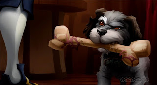
Spiffy the Dog


My copy is on the right.

the fur in the face could use a little more work however I think this study shows the concept. I pretty much followed the video that Babcock made on how to do this. The study took a little more than 3 or 4 hours but once I figured out the method and got into a rhythm, everything worked together. I really enjoyed the technique used here and definitely plan on working with it in the future. It is not a difficult technique and renders itself fairly nicely. If I get around to doing a interpretation of this I would probably do a rendering of bottles or some sort of packaging because I think this technique would lend itself well to making digital mockups of packaging quite nicely.

I will be disappearing for a few days. My parents decided to bump up this visit with family to this week instead of the week after class. Hopefully I have some time in there to post on blogs or update delicious or something to try and keep up.

After being able to view it on the webpage instead of photoshop, the lighter fur to the right of his eye needs to be touched up. But besides that I am pretty happy with my results


Sunday, July 19, 2009

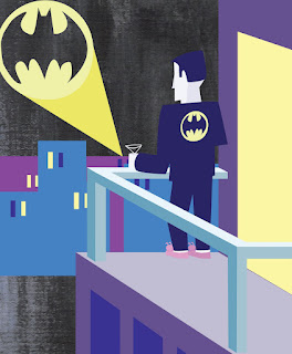
Batman's night off or Josh Agle Interpretation


I am still working with the background. The texture is really stubborn to work with but right now the image is at a place where I am happy with it. The image was sketched out in photoshop then taken to illustrator and completely drawn with the pen tool then brought back into photoshop to add the background texture. Everything went really smoothly, the only thing i had any trouble with was his bunny slippers and the texture, and the bunny slippers kinda just made themselves out of the remnants of these swanky shoes I was trying to draw. His right arm also seems a little awkward but I don't think it is really a big enough problem to adjust.

Week 4 Project:


This is an image of Spiffy the dog from the recent re-release of "Secret of monkey Island"...an old VGA game that they have completely redrawn and painted for the Xbox...From what I can tell the art was done by Jeff Sangalli as he is the only one listed in the credits under "art director". I was looking around for a while before deciding on this image. I wanted to do something that was an actual rendering instead of these somewhat flat images I have been working with but did not want to go for something completely out of my league. For the study I plan on tracing paths in illustrator then bringing them into photoshop then using brushes to render them. There was also a few videos from earlier in the class that I will probably re watch a few times. I do not recall their names but it involved rendering the chestplate of a robot in photoshop...Those videos seem like the should be very helpful for this project. It seems fairly straight forward but I am probably getting in over my head and just dont realize it yet.

Updates

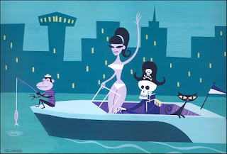
Josh Agle Study:


Update: I reshaped some of the objects to make them look "more correct" like the skeletons eyes and the womans swimsuit. I also recolored the bottom part of the water to make it look like it matches more.

Bear Wrestling:


Update: I added some paint texture to the flat bears and tweaked the wood texture to adapt to the paint texture.

Candies:


Update: I darkened the outlines of the candy wrappers and added a watercolor paper background to remove the "flatness" of the image.

Thursday, July 16, 2009

butterscotch candies or interpretation #2


This is my original interpretation based off the watercolor study from a while back. I went a little scribble happy, however i felt that it reflected the crinkleness off the candy wrappers. I also tinted the centers of the candy because I felt that they looked like they were missing something...I am currently toying around with background textures however I wanted to update to show that I am actually working on things. Around sunday I want to have a post with all the little tweaks and fixes I have been making to things.

Originally I started with a study of some flowers that my dad pulled from his garden, but after a few hours of toying with it, I realized the flowers were way more detailed than they needed to be and the problem with the image was not the technique used it was the complexity of the subject matter. I might go back and give the flowers a try again at some point after more practice and experience under my belt.

Monday, July 13, 2009

RAR bear wrestling


RAR!....ok enough of that.

I enjoyed working with the style. The wrestling bears are a really fun subject matter. I used a stock photo of bears playing to work from. I am not incredibly happy with this final image and could probably spend days trying to tweak it to get it the way I want it. I think the heads could be redone to include a part of the other side of the face like done in the original image. I put the wood texture on pretty heavy this time around too, I am undecided on how much I like the texture, but for the time being I will let it sit. The bears kinda look like they are dancing in middle school to a Lionel Richie song and not fighting....and the brown bears arm looks pretty awkward. However problems and all, It was a good image to work with. I know I am a "newbie" in the illustration side of things so with that taken into consideration, having a "imperfect" image is fine when the experience is the important part. And if I want to go back and work on this, I know where to start.

Thursday, July 9, 2009

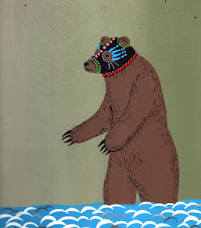
Bear Study


This image was alot of fun to work with. Everything went together really fast too. The hardest part was probably recreating the brushstrokes for the hair. Next step is to take a shot at the style with a different image. The background did not come out as well as I would have liked and I should probably put a subtle texture within the bears body itself since it is not just a flat brown color. The technique will probably be refined in my interpretation project. As for the interpretation, I think I am going to stick with the theme of wrestling bears...It just seems like you can't really go wrong there.

Wednesday, July 8, 2009

The most amazing image in the history of images

probably not...however I love it


This is probably the most amazing picture I've ever seen. While cleaning up my basement some I found a box from my childhood filled with what I thought was blank VHS tapes. It was actually a collection of early 90s professional wrestling that I at one point maintained. So logically Ive been watching old pro wrestling and wanted to get it out of my system so I went on google image search looking for some images of mexican wrestlers for some eventual art project and came across this image on the lonely robot blog.

The image actually seems like a logical next step for where I have been working. The image combines the flat drawing of the josh agle study, brings in some interesting brush strokes and textures. This little project should also work on my neverending task of getting better with accuracy in drawing.

Also who doesnt love a bear fishing in shallow water while wearing a mexican wrestler mask?

my plan is to recreate the entire image as efficiently as possible while just working on accuracy and improving newly learned techniques.

Plan of attack:
1. Draw vague outlines of the shapes with my pen and tablet in photoshop
2. Convert those outlines to vector images and color base colors in illustrator (upon a closer look, i dont think this step is necessary and could just be refined in photoshop)
3. Bring the image back into photoshop for detailing, little brush strokes and texture
4. probably pay too much money to have this printed on a t-shirt


This was a different image of a character from the new street fighter game that i also happened to come across and really enjoy the ink work. I am considering recreating this image and then following it up with a origional image trying to mimic the style since it seems right up my alley with the heavy outlines and ink work.

Tuesday, July 7, 2009

Watercolor Study

This took so much longer than expected, however alot of the time was spent getting used to the new tablet and creating brushes that I was happy with.

I still have not gotten the refined brushstrokes that the original artist can get with a real brush, but for a study I am not that unhappy about it... The garlic bulbs look a little awkward, accuracy in freehand drawing is not really my strongest point and is something I definitely need to work on.

My study is on top:


Tonight I plan on finding a new project to work on for a little while, but I intend on going back and retrying this image again.

Thursday, July 2, 2009

Progress in master study 1: part 2


Top image: Josh Agle
Bottom image: my study

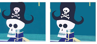
The colors and the monkey's shirt still need tweaking...I started to make the shapes seem more humanistic as suggested by professor Babcock. The recreation of the seasponge on canvas worked really well.


Running a gradient map over the above image replicates the texture perfectly.

Also my new tablet came in this afternoon...Its a little tiny but surprisingly came with a copy of photoshop elements 6, corel painter and some program called Nik Color Efex Pro that I have never heard of. It was definitely worth the $85 investment and highly recommended.

(Edit: after looking at the zoomed in image on here, I noticed the canvas texture was a little too prominent. On my next pass I plan on turning down the opacity on the texture layer to fix this)

Wednesday, July 1, 2009

Current Progress in master study 1


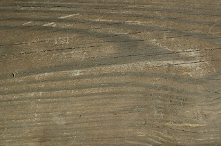
So this is my first study of Agle's work. Tonight I plan on recreating the entire image now that the skeleton guy is mostly out of the way. (I am betting he is the hardest part by a long shot [not really that hard...just obnoxious with the little details and the sometimes random nature of the pen tool]) The image is drawn in illustrator using the pen tool except for the space inbetween the boat and the buildings. That is a scan of a wood plank with a gradient map applied overtop of it.


The wood plank scan was found at textureking.com, an amazing resource for textures.